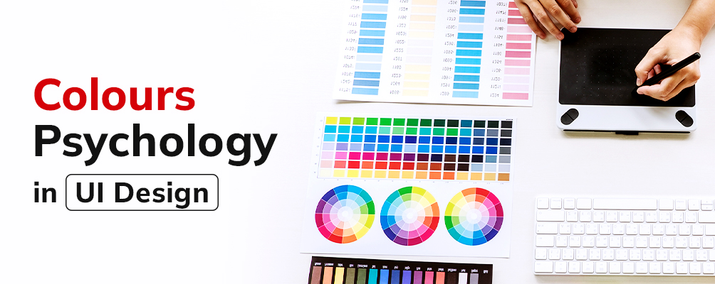
Apart from aesthetics, colors add visual impact to a UI design. Experts refer to the science of how colors affect human behavior as color psychology. Use of certain color schemes can set the tone and deliver the intended message instantly The color of the text, call to action (CTA) button and other links can influence your customers’ response to your brand.
This article talks about the diverse emotions associated with colors, and some salient principles of color usage.
How do colours affect users?
Colors can instantly affect the mood of a user. They reinforce the existing meaning in a message and express the same in the right mood. A study conducted at the University of Winnipeg found that nearly 62-90% of the time a product is judged by its color. Hence, the right color scheme can strengthen your brand voice and give you a competitive edge. For example, the yellow arches of McDonald’s or the use of red in Zomato.
Colour associations:
Colors stimulate our brain and trigger certain emotions. For example, the blue or green in nature can calm a mind, while red can induce feelings of anger or affection. Now that we know creating the perfect color palette is no easy feat, go through these color associations before creating a palette for your brand offerings:
White: Sterile, plain, virtue, purity, innocence, simplicity, wholesomeness, clarity.
Black: Fear, dark, death, danger, mystery, classy, elegance, power.
Purple: Mystery, magic, royalty, wealth, luxury, spirituality.
Blue: Faith, stability, trust, calmness, corporate, distance, sadness.
Green: Nature, calmness, renewal, freshness, inexperience, health, safety, money.
Yellow: Positivity, happiness, sunlight, warmth, joy, caution, error.
Orange: Excitement, energy, enthusiasm, friendliness, creativity.
Red: Love, passion, confidence, strong, power, courage, danger.
While understanding the emotions associated with each color, let’s also get an insight into some color terminologies that every designer should know.
- Hue: A saturated color without any black or white added to it. It is also referred to as the parent color.
- Tint: White added to hue
- Shade: Black added to hue
- Tone: White and black (or white + black = gray) both added to hue
- Value: How dark or light a colour is
- Saturation: Brilliance and intensity of a color is known as its saturation. Dull colors have low saturation, while vibrant colors have higher saturation.
- Color weight: Darker colors are perceived as having heavy color weight. For instance, yellow is known for light color weight, while blue or red have heavy colour weight.
5 principles of color usage in UI designs
Set hierarchy
When a component contrasts its surroundings, it draws more attention. By this rule, we can set hierarchy to different elements on a page with the help of color and color weight.
Limit colour
If you want to draw your audience’s focus on content, you can limit the color used to just the content while maintaining a near colorless background. When you limit the color used on an interface, areas with color receive more attention.
60-30-10 rule
This timeless rule for interior designing gives a balance of colors in a space. One can use these proportions to enable people move their eyes comfortably from one focal point to another.:
60% (dominant hue) + 30% (secondary color) + 10% (accent color)
This rule is applied to design digital products also. It will ensure that you don’t go over the top with colors. You can refer to the color associations to decide the dominant color for your brand logo, digital app, or web page.
State of a feature or element
You can display a change in the state of an element with the help of colors. Muted colors of a button mean disabled or not functional. In contrast, a red call to action button can make it more noticeable to a user. A lot of times we see warning pop-ups in yellow or red, to show message urgency and grab the reader’s attention instantly.
Colour consistency
Color consistency helps users perceive the same meaning across your web app or mobile app. If you want to draw the attention of a user to a different component, use a different color. For example, if your app has red as a dominant color, refrain from using red color for an alert message or an error state. It might go unnoticed. Instead, new alerts can be in white or yellow, depending on the theme of the alert.
Final thoughts
Color concepts can be tricky to master but with practice, you can learn more, and create a host of stunning schemes. Before that, take the help of some tools to refer to the color wheel and play with different hues, tones, shades, etc. A few tools to try out are Google color tool, Coolors.co, Dribble.com/colors, Paletton. You can start creating your stunning color palettes now.

No Comments