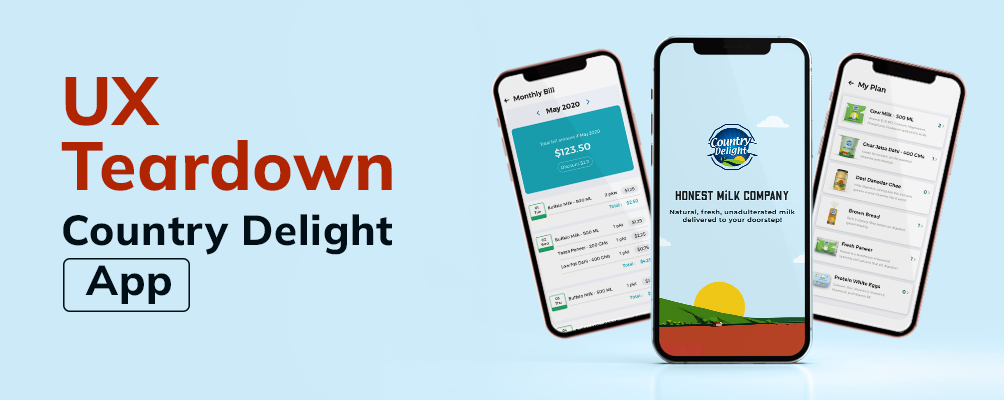
Country Delight
UI/UX Redesign Case Study
By Yugal Mahajan
Mobile app teardown – COUNTRY DELIGHT
A visit to the nearby dairy early morning to procure fresh milk is a common practice in India. Doing this on a daily basis, however, can be monotonous and difficult especially on cold winter mornings. One of our product designers faced a similar problem and subscribed to the Country Delight for his daily milk supply. However, he found design issues that hampered the usability of the app. He decided to analyze the app’s UX, UI and design, functionality and performance, messaging, with the help of user reviews. And this is what he did.
- What is Country Delight
An app that promises delivery of natural, fresh, unadulterated milk at the doorstep of the consumer. Placement of orders and servicing happens through a mobile app which makes it easy to manage one’s milk requirements.
The milk brand startup, which facilitates hyperlocal delivery, is currently servicing 200,000 families across Delhi, Mumbai, Pune, and Bengaluru.
- Why Redesign Country Delight
Country Delight fits the requirement for daily milk supply. Except that the app needed changes in architecture and visual identification. The UI was unsatisfactory – be it the illogical splash screen or starting the milk subscription. There were several other problems blatantly visible in the app.
- UNDERSTANDING THE USERS
- User Interviews
Six users were interviewed to understand their feelings and frustrations about the application. Here are some of the questions asked during the interview –
- How did you get to know about Country Delight?
- What makes you trust Country Delight products in comparison to other big names like Amul, Mother Dairy?
- How does Country Delight app fulfil your daily milk requirement?
- How seamlessly can you start a subscription through the app?
- How does the app communicate regarding delay in delivery or the COVID protocols?
- Have you encountered any problem in using the app or the service they are providing? If yes, then what were the steps you took to resolve it?
Some key insights derived from the interview:
- Most of the participants did not like the home screen of the app which does not highlight the milk products.
- Almost all the participants complained about the difficulty
- None of the participants had information about separate delivery of milk and grocery items. The common assumption was that all the products (be it of any category) would be delivered at one go.
- Most of the participants found it difficult to trust the quality of the products, apart from milk.
- Most of them said they were unable to scroll the calendar to the previous date.
- The application doesn’t offer the flexibility to order multiple products at the same time.
- Most of the participants were looking at review screen before placing the order.
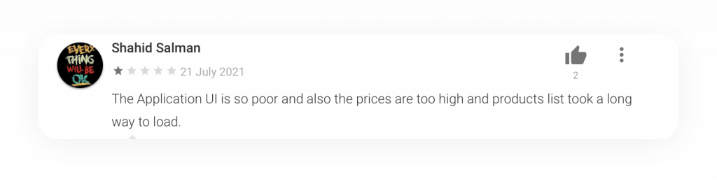
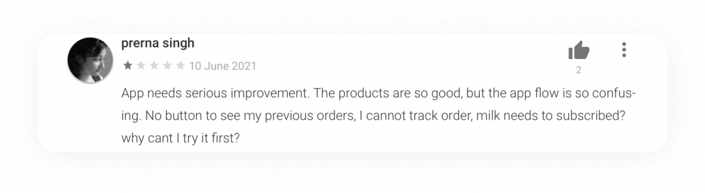
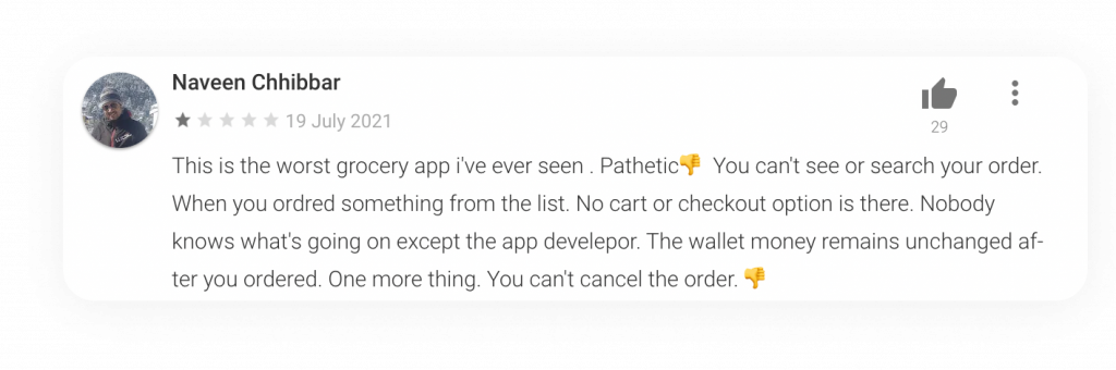
2. Going through the existing user reviews
Unable to add multiple products
Unable to update primary number
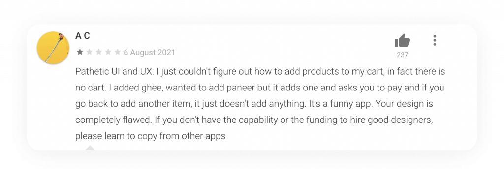
Confusing user interface
No product info


No cart and search option
- Usability Testing
After the interviews, all the six participants tested the app. The idea was to check how they would interact with the app’s features.
Some of the tasks given to them were –
- Install the application and create your account
- Schedule the delivery of any one of the products for the next day
- Schedule the delivery of multiple products for the next day.
- Subscribe the delivery of milk for a month
- Search for a specific product
- Edit the subscription of the subscribed product
- Recharge the wallet
- DEFINING THE PROBLEM
a. Confusing home screen
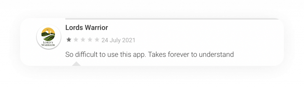
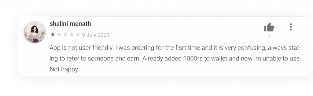
Users complained of a confusing home screen UI. They were looking to order milk products but struggled to figure the product categories and listings.
b. Unable to order multiple products
Purchasing multiple products was a struggle for all. Single product purchase was easy but people were frustrated when they had to add multiple products in the cart.
c. No cart option
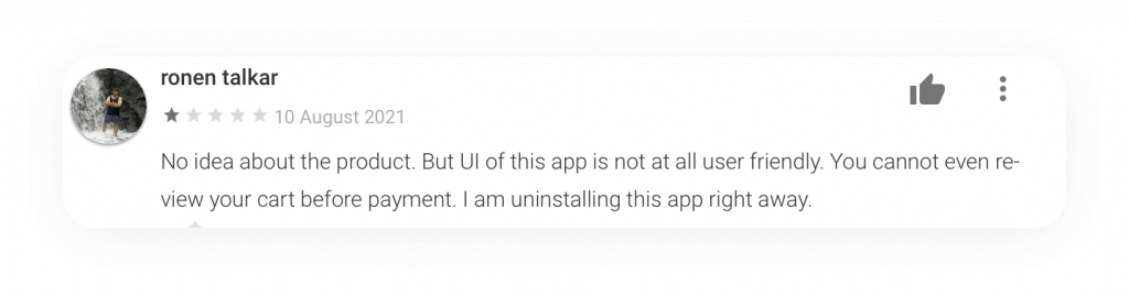
The experience became worse when users found no option to add the product to the cart. Not finding a cart feature in an e-commerce site can be strange indeed!
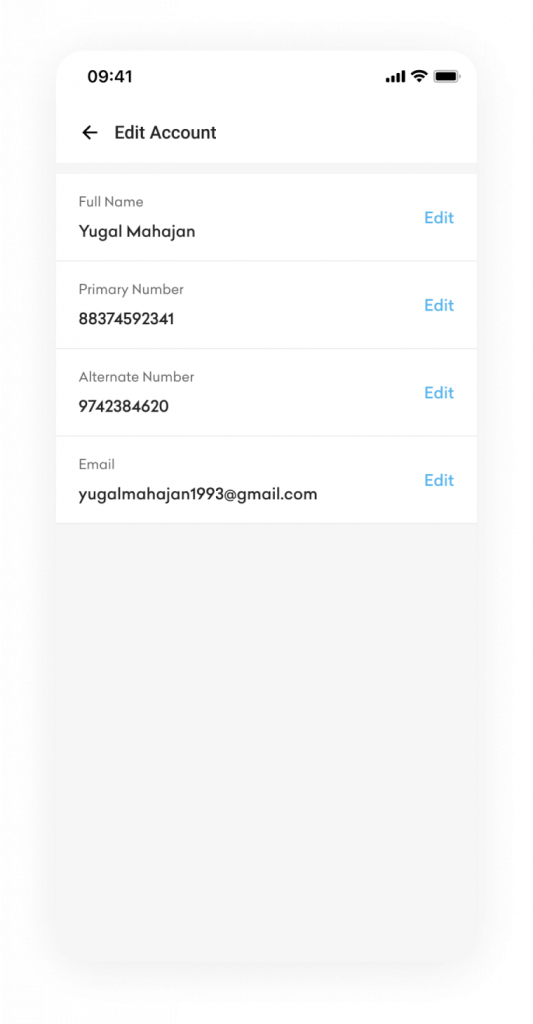
d. Unable to update the primary phone number
The app doesn’t allow updating contact details, and limits users to edit personal details.
e. Access to the calendar
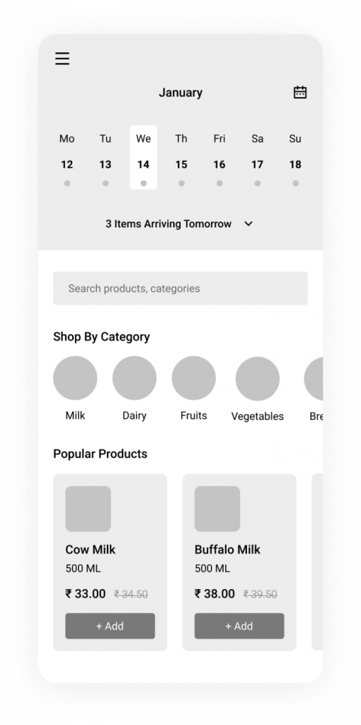
Viewing the calendar of upcoming deliveries is a tedious task. Users have to scroll the calendar on the home screen horizontally since only seven days are visible in a single view. This means one has to rotate the phone to view the calendar.
f. Difficulty in trusting the product
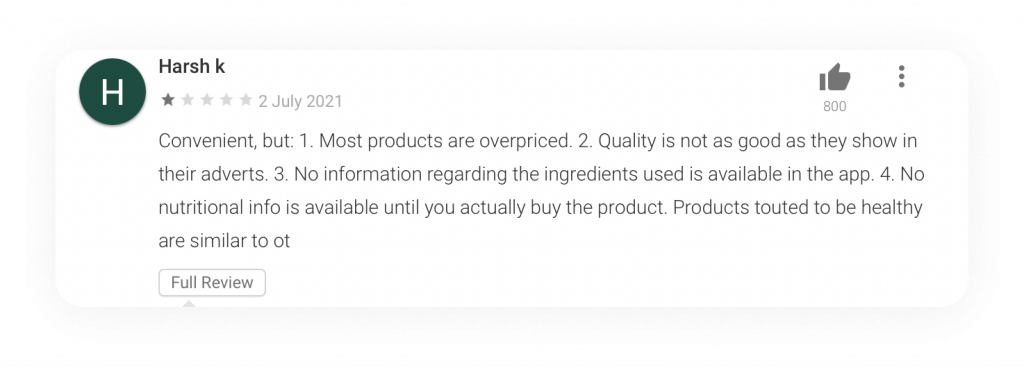
The quality of products was questionable since the app does not detail the benefit of the product, explain why the products is good, or nutritional facts.
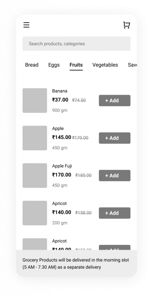
g. Difficulty in product search
The search bar was not clearly visible and users found it difficult to search for specific products.
h. Grocery delivery
Some people who bought grocery with the help of the app complained that they were not informed regarding the separate delivery of milk and grocery items. They were expecting the groceries to get delivered in the morning along with the milk. But the groceries were delivered by a different delivery executive. This became inconvenient and confusing for users.
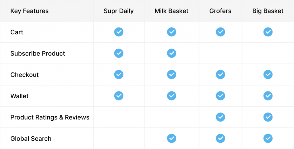
- COMPETITIVE ANALYSIS
Analysing the competitor applications helped me understand what competition is doing right, their strength, lapses, weakness, and most importantly, a way to improve the product to achieve a competitive advantage for both the business and customers. The analysis carefully compared different delivery applications operating in the market which are similar to Country App.
- IDEATION
a. Paper Sketches
After carefully going through the research outcomes, and doing a comparative study of the competitor
This process helped select the best layout before jumping into the high fidelity designs.
b. Wireframes
After sketching a couple of layouts to figure out what could work and what wouldn’t, here are the sketches converted to high-fidelity wireframes. This would make the visual design process faster and easier. The usability testing was re-conducted with two users and their feedback incorporated in the actual UI designs.

- THE REDESIGN
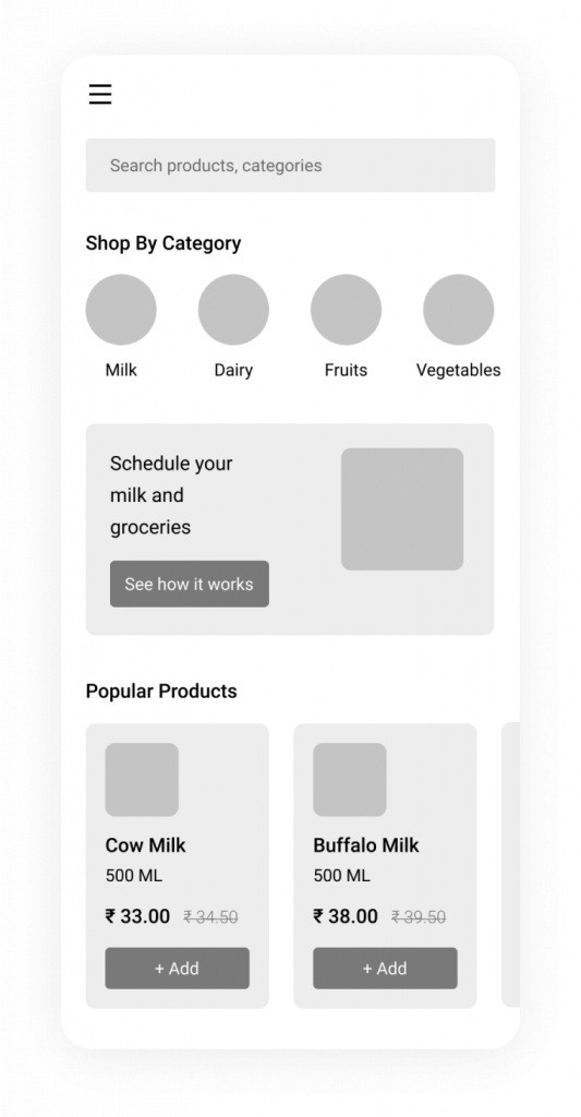
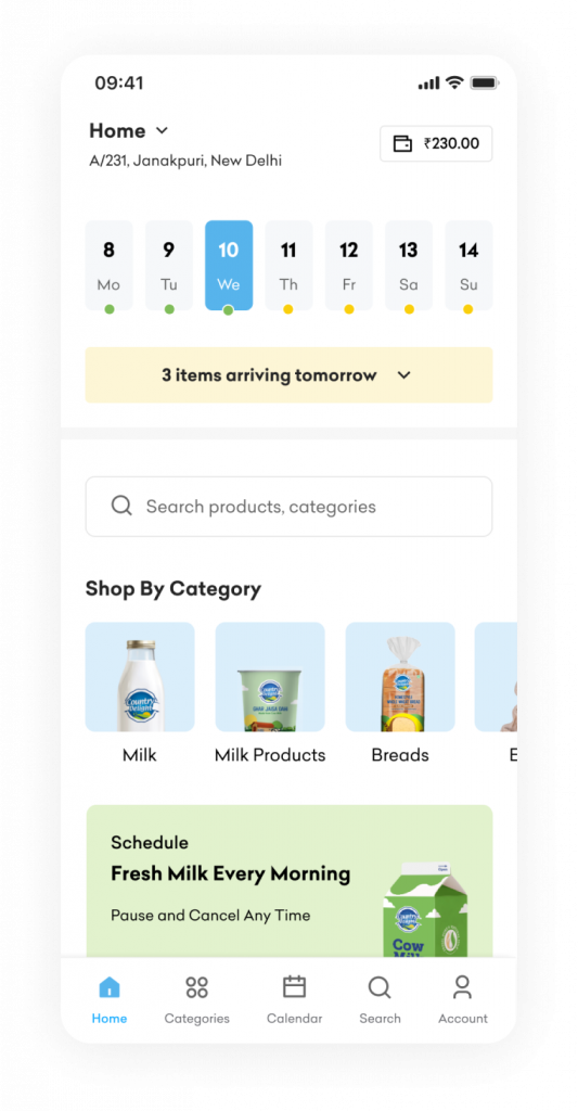
- Home Screen
Current Issues
- The current home page UI looks cluttered and unpleasant at the first glance, with not enough breathing space.
- The Bottom Nav has not been efficiently used. Apart from ‘Refer & Earn’, options such as Search can also be included.
- The app doesn’t highlight its USP i.e. Milk. The option to explore products is also confusing.
- No option to edit or cancel items that are to be delivered the next day.
- Too many promotional banners are showcased to users, which ruins the consumer experience.
Proposed Design
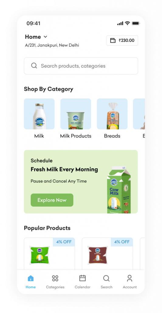
- Informing users about the next day deliveries. A collapsed section to let users view the upcoming deliveries, edit, cancel or add more items.
- Update of the Bottom Nav Bar by replacing the “Refer & Earn” option with two additional options – “Calendar” and “Search”. Calendar will enable users take a quick full glance over the upcoming deliveries and schedule.
Search will allow users a quicker access to products of their choice.
- Showcase the product categories upfront, making it easier for users to navigate categories. Milk, being the USP, is placed at the top of the app page.
- Banner emphasising the benefit of scheduling milk delivery with an “Explore Now” button. By clicking on the button, users will get details on how to schedule, FAQs etc.
- A list of trending/popular products will build trust among the users.
- More space between components for a neater and more organised UI, within the defined brand colors.
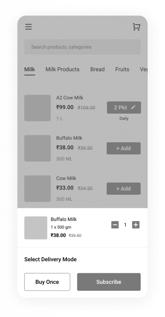
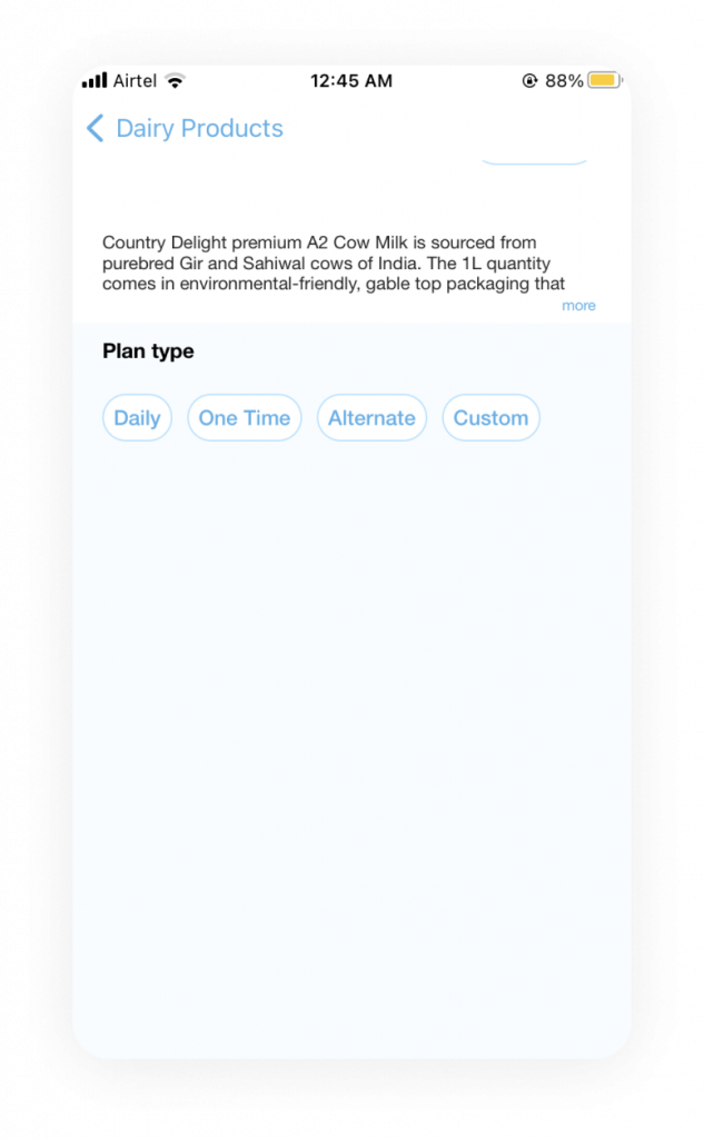
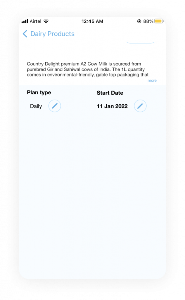
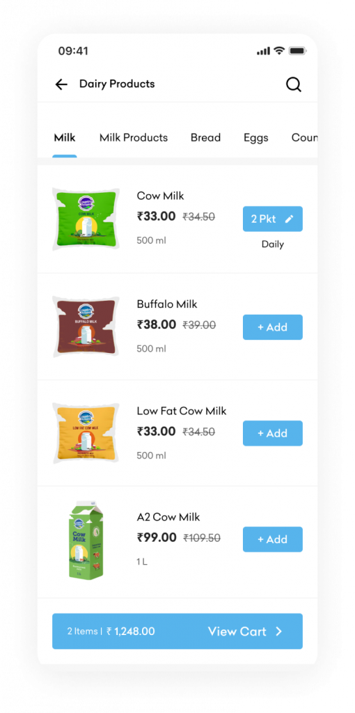
- Dairy Products Listing
Current Issues
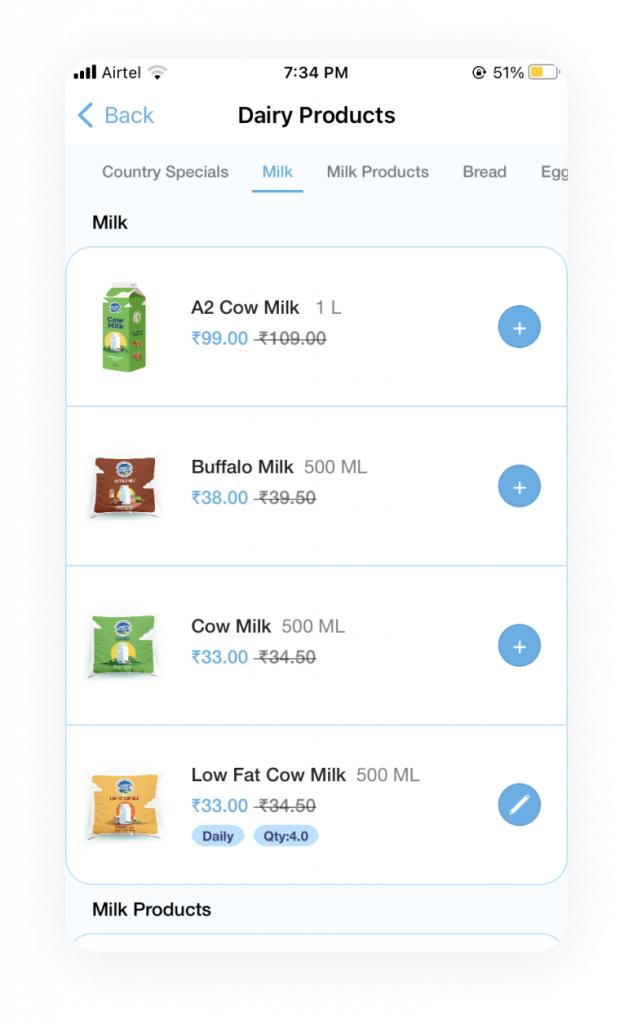
- Not enough information provided for products, increasing skepticism among first time buyers
- Confusing UI for scheduling the delivery of product.
No option to search for products within the list.
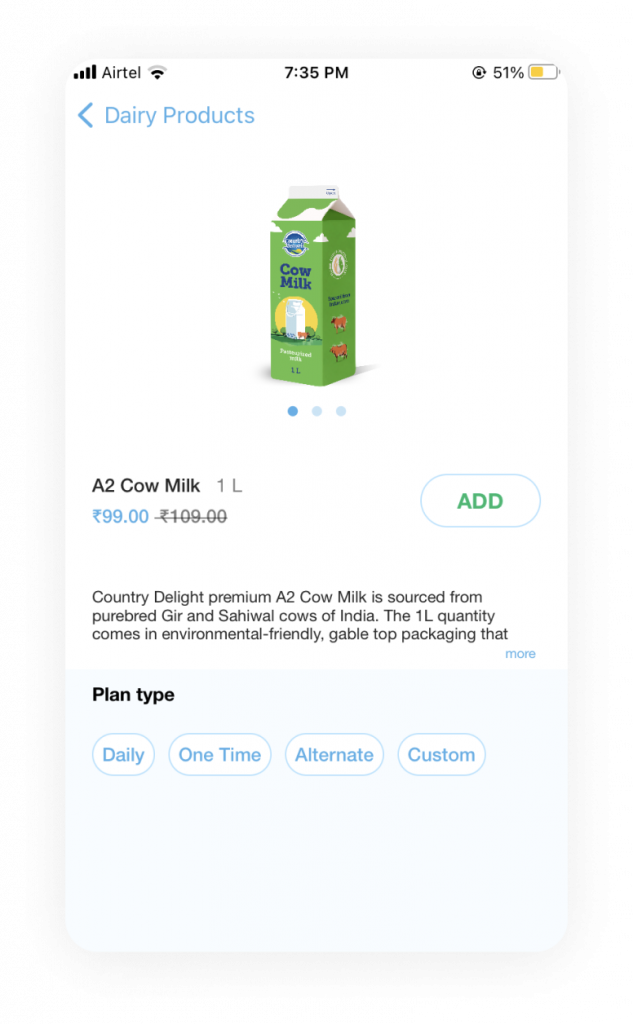
Proposed Design
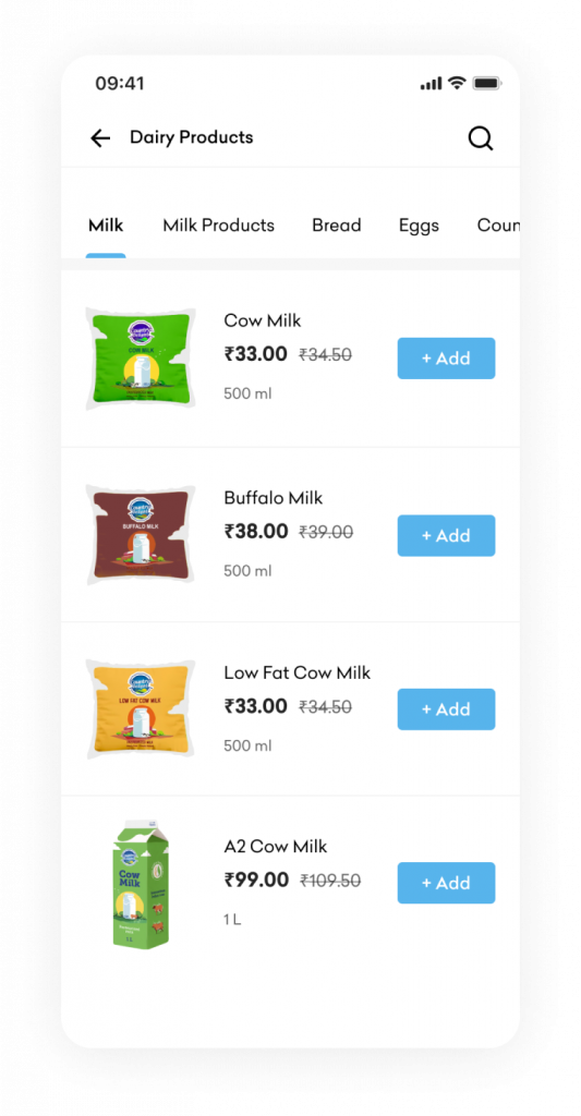
- Search Option will allow users to look for any specific product.
- Enlarged “Add” button for users to notice and add products to cart.
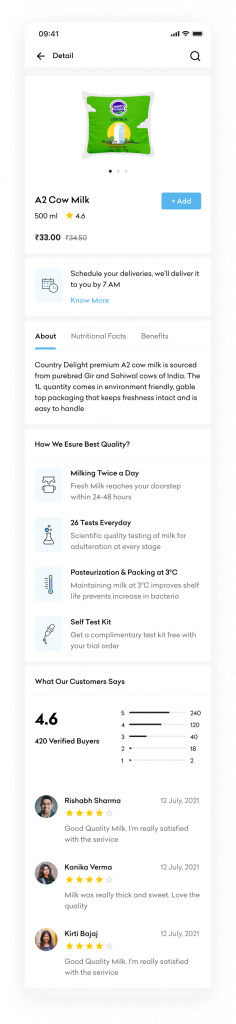
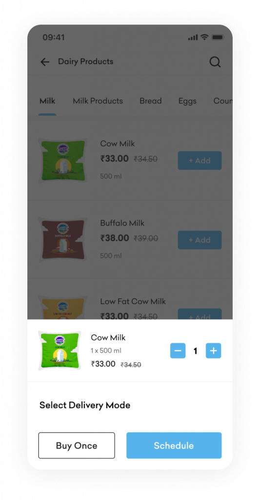
By tapping on the “Add” button, users will be prompted with two options for product delivery –
1. Buy the product once. By clicking it, he will be able to add the product to the cart.
2. Schedule the delivery. Tapping on it will redirect him to schedule delivery steps.
This will clearly provide two possible options for product delivery.
- Basic description about the product along with its benefits and nutritional information will help users understand the product better.
- Schedule Delivery section will educate users about the process of subscribing a product delivery.
- Educating users about the quality of the product will help in increasing their confidence and build trust among them.
- A section for consumer reviews to add credibility to the brand.
- Grocery Products Listing
Current Issues
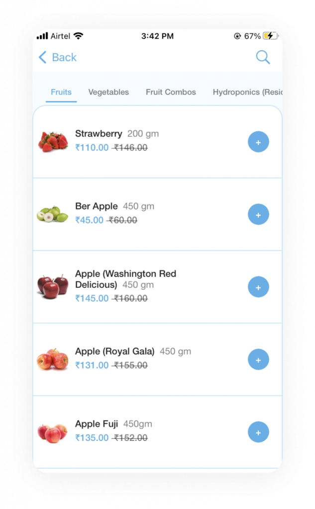
No prior information regarding separate delivery of milk and grocery products.
Proposed Design
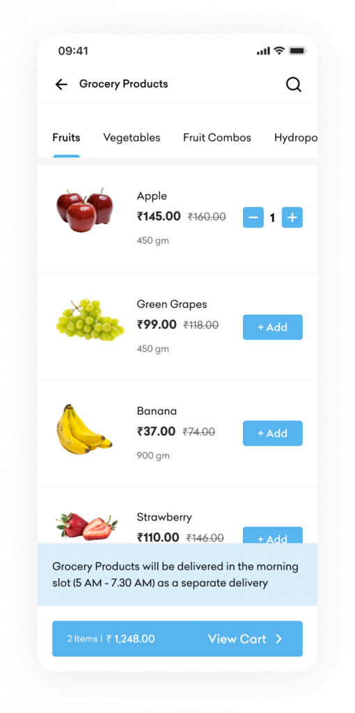
Display of the delivery schedule to inform users about the separate delivery.
- Scheduling of Delivery
Current Issues
- Lots of empty, unused space. UI is not pleasant.
- No instructions given about how to start the subscription/scheduling of delivery, making it confusing for first-
- No information provided regarding the total price the user would have to pay or recharge their wallet.
- After selecting the delivery schedule and start date, users are not asked about the delivery time slot and delivery instructions. At present, the selection of the delivery time slot and setting up of delivery instructions are under profile settings, which is not very user-friendly. These features should ideally be placed under ‘My subscriptions’.
Proposed Design
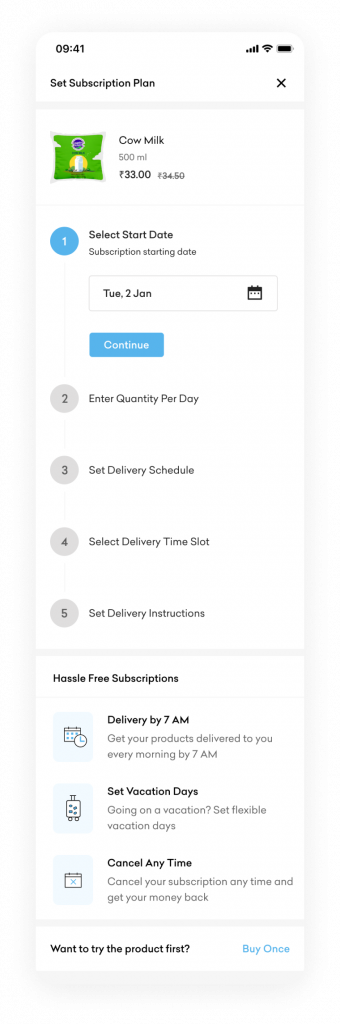
Divided the subscription steps by introducing a stepper that will help users navigate easily and scan information.
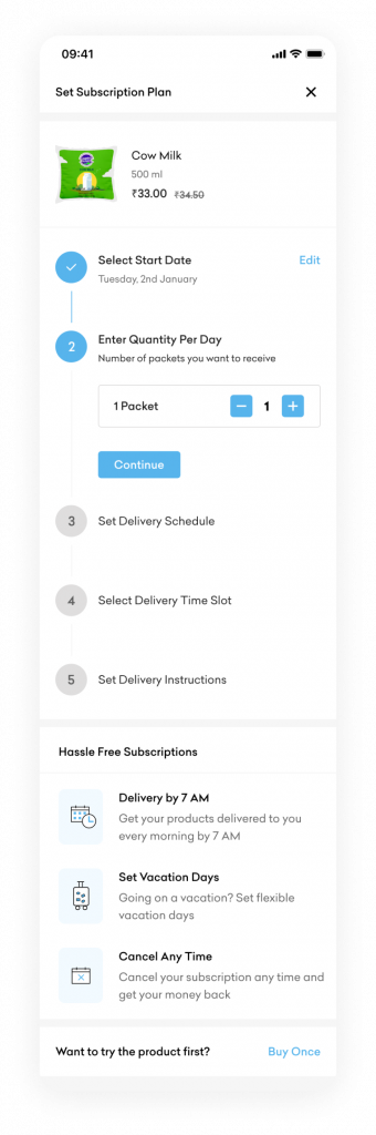
- Added an informative section that briefly explains the key features of the subscription.
- Users can still proceed with the one-
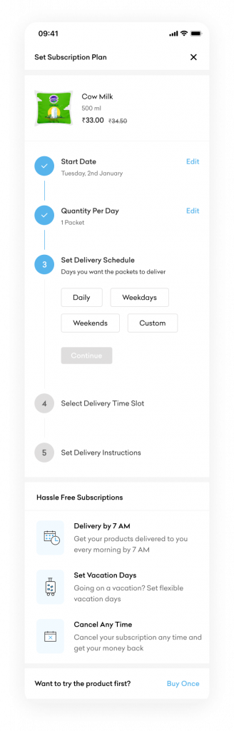
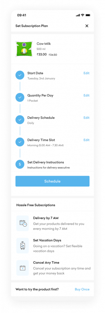
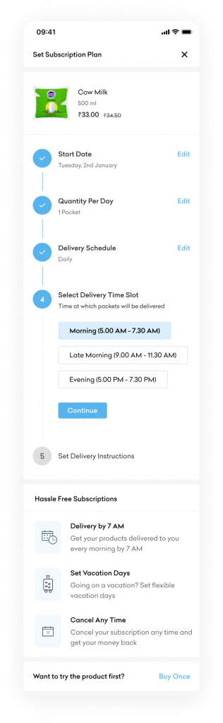
After completing the subscription steps, the same will be added to the cart. User can add other products to the cart before final payment.
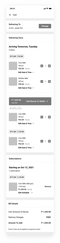
- Cart
Current Issues
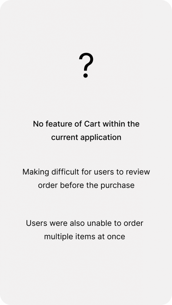
- No feature of Cart in the current application.
- Difficult for users to review order before purchase.
- Users were unable to order multiple items at on go.
Proposed Design
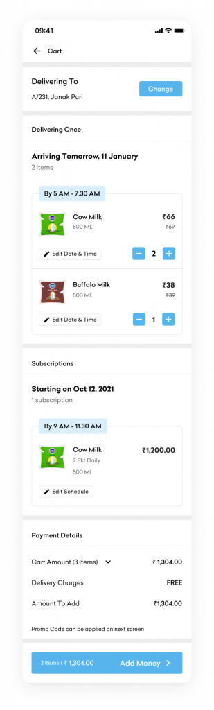
- Section informing users about the address where the items will be delivered.
- Section mentioning the items that will be delivered at one go.
- Users are also given the flexibility to ‘Edit Date and Time’, ‘Update Cart quantity’ in the same screen.
- Section to feature subscription offers. With the option of ‘Edit Schedule’, users can make any modification within the schedule.
- Payment Summary to show price breakdown of the items within the cart.
- Action button informing users about the next step and the final amount required to recharge the wallet.
- Option to apply any applicable offers. By tapping on the button, a bottom sheet will appear with all the offers along with the option to add any custom coupon code.
- Clear UI with the prefilled amount that is required to place the order. User can also edit the same.
- Action button with the final amount that user has to pay.
- Calendar View
Current Issues
- The app doesn’t allow users to change the month and see the status of past deliveries.
- With the current calendar view, only 7 days were visible for the user in a single view. They would have to scroll horizontally to access the rest of the days.
Proposed Design
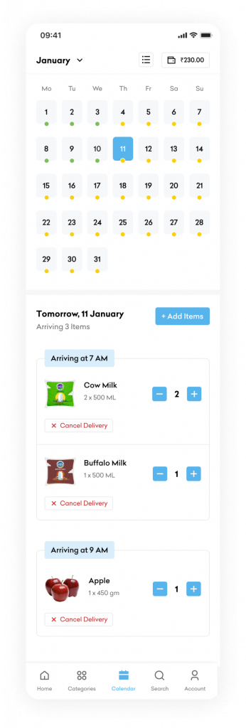
The users have the option to switch to any particular month.
Given the user the flexibility to do the following for any upcoming delivery –
Add items
Update items
Cancel delivery
Separate option in the Bottom Nav to easily access the Calendar View of upcoming/past deliveries.
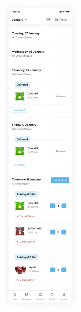
Option to switch calendar in two separate views –
List View: Allows users to scroll through the dates easily.
Calendar View: Allows users to easily view the status of each day within a month.
Option to reach out to Customer Care in case of any issue with any past deliveries.
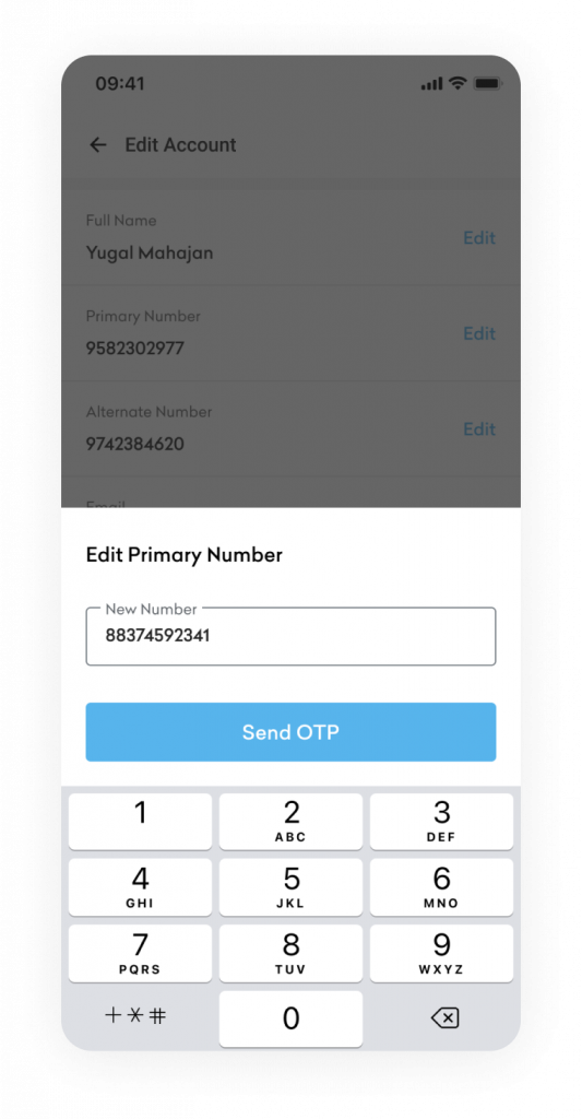
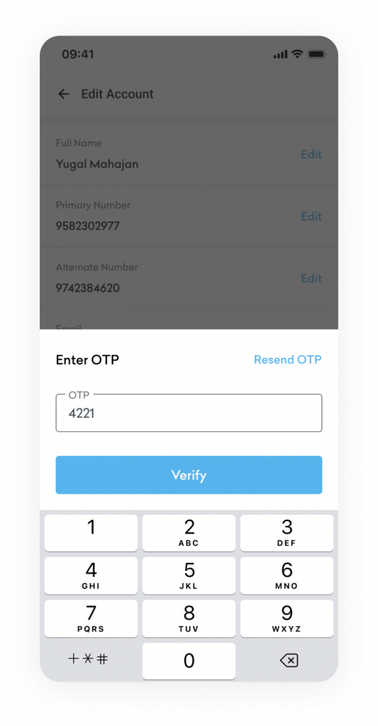
- My Account
Current Issues
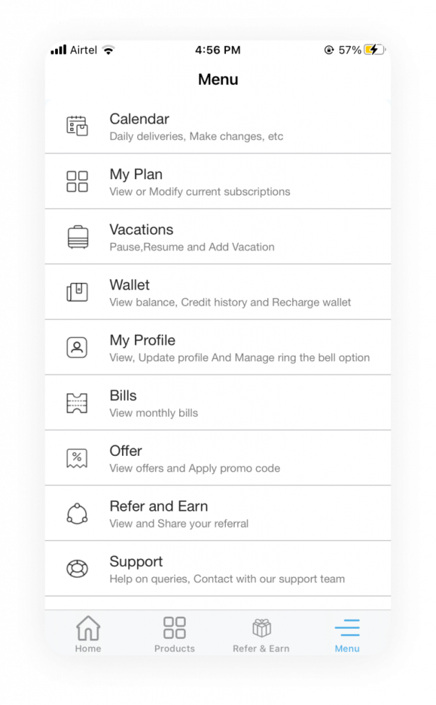
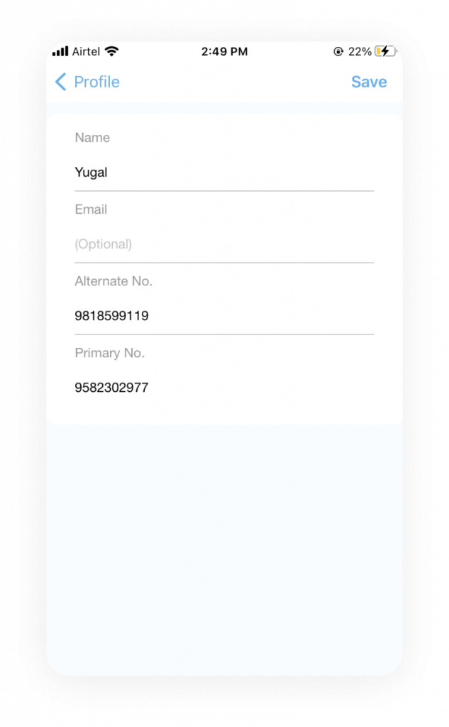
- Too many options for the user, making it difficult to scan and access the relevant options.
- No option to edit the primary number.
Proposed Design
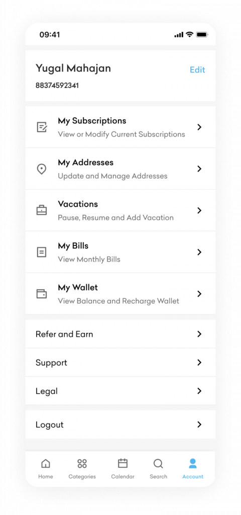
- Divided the screen into multiple sections to improve the visual hierarchy of options.
- Basic account details were displayed upfront with the option to Edit.
- Kept the secondary options in a separate section without the icons to reduce prominence.
- Search
Current Issues

The search bar/icon should be the most prominent and accessible feature. Whereas, the only search within the application is at the grocery products listing screen. Global search can also be made available to users basis the product’s availability in various cities.
Proposed Design
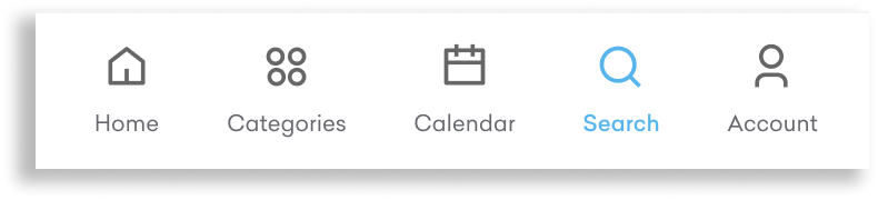
- Added another option in the bottom nav for easy product search.
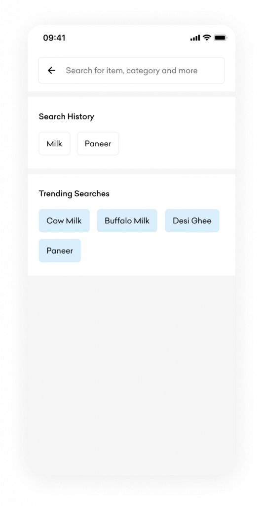
Sections for ‘Search history’ and ‘Trending searches’ to enhance the experience.
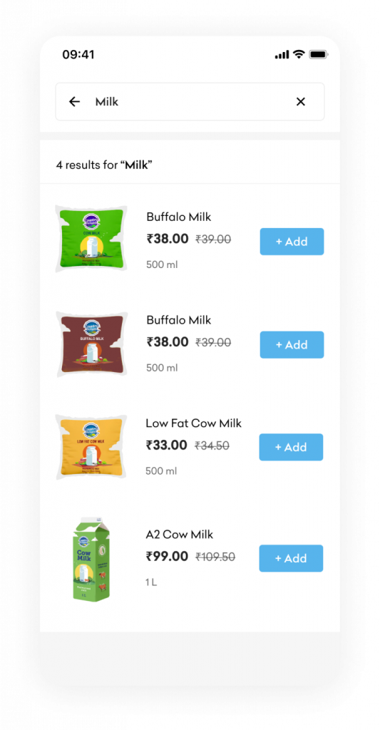
Search result will display all the relevant product with options to quickly add the product to the cart. By tapping on the product, user will be redirected to ‘Product Detail’ screen.
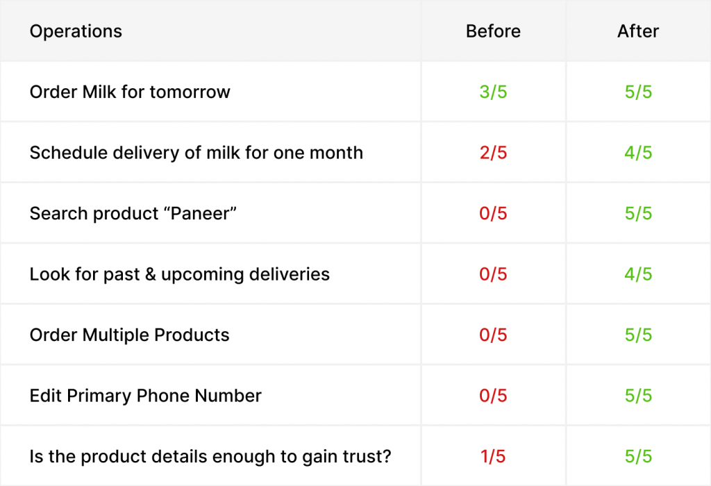
- USABILITY TESTING
To validate the design changes, five people were requested to perform certain operations on the current Country Delight app and the redesigned version.
Below are the results –
- RETROSPECTIVE
Redesigning the application was fun and challenging at the same time. Deep diving into the current architecture and reimagining a possible solution that would improve user experience was a creative and fulfilling experience.
Usability testing after the wireframing and UI stage played a crucial role in the redesign process and offering a possible solution.
Hope you found this redesigning journey interesting and insightful.
Thank you for reading!


No Comments